
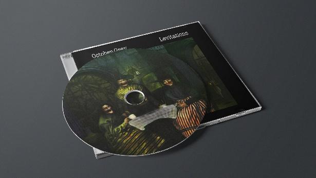
October Grey are a metal band whose visual identity is rooted in gothic horror, occult imagery, and the macabre. When they approached me to create artwork for their EP Levitations, they had a clear vision: witches, ritualism, and a sense of genuine unease rather than the polished, Hollywood-inspired version of witchcraft often seen in popular media.
The brief centred on three laughing witches gathered around a cauldron filled with unnameable horrors, with the Book of the Dead looming behind them. The band specifically wanted the figures to feel grounded in Wiccan and folk traditions, avoiding fantasy clichés in favour of something darker and more unsettling. The challenge was to create an image that felt disturbing without relying on shock value, an atmosphere of dread rather than outright violence.
From a design perspective, I initially pushed for a brighter composition to showcase more of the detail in the artwork. The band argued for the opposite, insisting the piece remain shrouded in darkness. In hindsight, they were absolutely right. By allowing much of the image to disappear into shadow, the artwork became far more effective, forcing the viewer to search the darkness and discover its details piece by piece. The result felt less like an illustration and more like stumbling across something that wasn’t meant to be seen.
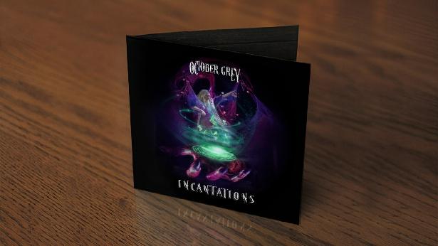
A few months later, the band returned for artwork for their follow-up EP, Incantations. While continuing the occult themes established in the previous release, this piece shifted its focus to a solitary sorcerer consumed by his craft. Lost within his rituals and spellwork, he remains oblivious to a monstrous, deformed hand emerging from the darkness below him, moments away from dragging him into an unknown fate. The image built on the atmosphere established in Levitations, leaning further into tension, storytelling, and the fear of unseen forces.
Alongside the artwork, I also developed a refined logo and custom lettering system for the band. Inspired by classic metal aesthetics while remaining distinctive to October Grey, the typography helped unify the releases and establish a stronger visual identity across their wider brand.